Search This Blog

Friday, August 31, 2012

A Victorian Romance

This month I decided to make my Jewelry Creators Unite In Numbers (JCUIN) collection on Artfire with a Victorian Romance theme.  I'm not an expert on styles.  I don't know exactly what makes them Victorian or Romantic, other than I think they are.  So here is a closer look at some of them.  If anyone wants to share their expertise on whether or not they're actually Victorian style or not, feel free to enlighten me!


Dusky Pink Lucite Filigree Cocktail Flower Cha Cha Ring adjustable

I love this cha-cha ring with a dusky pink rose.  Actually I love the rose all by itself because it looks so real you just want to smell it!  But it looks even better with all those leaf and filigree layers that Sally of Crystal Bazaar has added to it in the process of making it into a ring.   I did not know this, but apparently a cha-cha ring is a ring that is made by attaching beads to it.  When I think of Victorian, I think of flowers and filigree, so this cha-cha ring fits the bill in my opinion.


This one, called "Bling in the Holidays" by Holly of Au Naturale Jewelry, might be a little more modern spin on the romantic Victorian look.  I think the fact the filigree is flat looks a little more modern, but what do I know?  It still has filigree, and it has crystal dangles as well!  This would make some great bling for a holiday party.


Here's a stunning pair of earrings that is in the collection along with the matching necklace by Strega Jewellry.  It is very ornate, which I think is another feature of the Victorian era.  She has added a very nice verdigris patina with a little accent of merlot wine.  I love the combination of the green patina with the shiny pearl-like glass beads.

Prehenite Earrings
   

I picked these earrings because of the embellished little hearts with dangles.  That makes it Victorian Romantic inspired in my book.  These prehenite and sterling silver earrings were made by Jill of Jill's Jewelry.  The round beads are prehenite, and the little bicones up top are Swarovski Crystal.  An interesting fact I learned about Jill by looking at her Artfire Bio page is that she is actually a practicing attorney. 


These sterling silver and cultured freshwater pearl earrings are made by me and you can find them at Shanghai Tai.  I had these sterling silver components for awhile and finally decided to make something out of them.  Each Swarovski crystal and each pearl is close wire-wrapped onto the intricate sterling chandelier component.  Certainly romantic, are they Victorian?  I don't know, maybe if I had used black pearls and crystals they would be Goth!


Lastly, this chain maille bracelet and earring set by Moxie Gem Designs isn't actually Victorian at all.  It's use dates back to a much earlier era.  But this jewelry, in my opinion, gives an illusion of having that intricate detail like that romantic Victorian jewelry has.  The intricate design itself is made from many individual jump rings all put together.  This bracelet and earrings is a little mini work of art in itself.

I hope you enjoyed my pretend romantic jewelry journey though the Victorian era.  If you'd like to see the rest of the "A Victorian Romance" collection, you can find it here:

http://www.artfire.com/modules.php?name=collections&op=details&cid=37229

Thanks for looking!

Thursday, August 30, 2012

Lottie's Trinkets - On Fire For Handmade Artisan of the Week

Quality Original Artisan Jewelry


This weeks Featured Artisan is Lise Spence-Parsons,  Lottie's Trinkets. You will find original Artisan Jewelry handmade by Lise in her shop. Quality craftmanship and beautiful designs. Truly unique OOAK pieces!

You can find Lotties Trinkets on:


Grab the code for your blog HERE

Thursday, August 23, 2012

Blue Highways - On Fire For Handmade Featured Artist


Share the Love... Blogger's Unite

Wonderful creations by Andrea - Blue Highways
You can find Blue Highways On:

Tuesday, August 14, 2012

Featured Artist: The Handmaden Soap Co.

Featured Artsian - Share the Love, Blogger's Unite

This weeks Featured Artisan is Tracy Cornell - The Handmade Soap Company (formerly Braggin' Rights Bath) Indulge yourself in luxury with these wonderful bath and body products!

You can find the Handmade Soap Company on:


See her Full Feature on the On Fire for Handmade Site! Grab the Code for your Blog HERE

Friday, August 10, 2012

Blog Hop - Red Hot Fire!


It's a Handmade World (Hopes and Dreams Studio) is having a blog hop. The theme for this blog hop is Red Hot Fire! If you have a handmade item with a fire theme, you can post a link to it here by clicking on the "click here to enter: below. Also it you have a blog, please feel free to share this on your blog by getting the html by clicking on "get the code here" link below. And don't forget to BUY HANDMADE! Thanks to Hopes and Dreams Studio for hosting this blog hop.


Wednesday, August 1, 2012

A Walk in the Enchanted Forest


With the hot weather, I decided to do a collection that would make me feel nice and refreshed.  So here are some pieces from my "Enchanted Forest" collection on Artfire.  These are all pieces made by the talented members of the JCUIN guild, and I will highlight a few here.

Take a walk though the Enchanted Forest with me:

The first piece was really the inspiration for the collection, because it looks so nice and cool, and just a little magical:

Handmade Earrings Green Prehnite Hematite Gemstone Beaded Jewelry OOAK

These earrings are made with Green Prehnite beads and Hematite roundels.  Don't you just love the look of the green prehnite?  It's just luminous, like something you might find glowing after dark in an enchanted forest.  These "Forest Medley" earrings are made by Catherine of Shadow Dog Designs and she also has a matching necklace!

Imagine walking through the enchanted forest; do you think you might see a butterfly on a rock?

Just a Fairy Princess

This butterfly has a small fairy in the middle!  But that shouldn't really be a surprise in the enchanted forest!  It has a green patina and is on a brass chain with asymmetrical accents.  This necklace, called "Just a Fairy Princess" was made by AuNaturale Jewelry.

The forest is full of deep greens, but I couldn't forget that there are also lots of browns.  Here is a beautiful pair of brown earrings that look right at home in the forest:

Golden Turquoise and Antiqued Brass Leaf Earrings


These earrings were made by Daly Craft Works.  They almost look like copper hammered disks to me, but they are actually golden turquoise disks paired with some brass leaves.

Sometimes, when you're walking through some very dense, dark forest, you can see rays of light streaming thought the trees, making little patches of bright green:

Luscious Lime Delight N048

This necklace is called "Luscious Lime Delight" (but I think it looks like sun-dappled forest green.)  It was made with gorgeous 20mm black and lime swirled lampwork beads by Cathy of Caty Ann's Creations.

While walking through the forest, sometimes you find little vines (or big vines) or accidently run into little spider webs.  That's what these earrings remind me of:

Wire Knitted Earrings Featuring Green Glass and Copper Discs - BNC


Like little tiny vines growing all tangled up together, these earrings are made from knitted copper wire by Kath's Elegant Accessories.

Lastly, sometimes when you are walking in the forest, you are lucky enough to find a pond or a stream.  Maybe you will throw in a stone and make a splash:

Spiral green fused pendant reversible copper wire wrapped 1x1 Any Age Unisex

This spiral design fused pendant looks like ripples on the water deep in the forest.  The handmade pendant is reversible and you can find it at Shanghai Tai.

To see the rest, you can view the collection in it's entirety here:  Enchanted Forest Collection

Thanks for walking through the Enchanted Forest with me!

Friday, July 13, 2012

Blog Hop - Summer Colors

Here is another fun blog hop.  This time it is hosted by Vicki of Shymouse Crafts.    The theme for this one is Summer Colors.  So if you would like to add an item with summer colors, feel free to do so.  Also if you would like to share this block hop on your own blog, click on "get the code here" below.  Enjoy.


Blog Hop: Earthtones

Hopes and Dreams Studio is having a blog hop.  You can post your handmade item here.  If you have a blog you can "get the code" below to share this on your blog.  Thank you to Hopes and Dreams Studio for hosting!


Sunday, July 1, 2012

Cropping Your Photos to Show Detail


The last couple of weeks I have been very inspired to improve my product photography by reading a lengthy post in the Artfire Forums.  Here is the link to it, but I think you have to be logged in to Artfire to read it:


Photography Q & A


I'll warn you, it's 76 pages long!


Now I am an amateur photographer, and I have even won awards for my photography.  But when I approached taking photographs for my Artfire shop, my approach was to show the piece -- like the Sears catalog maybe?  I showed what the product looked like on a plain background, usually white and sterile.  Anyway, I have come to the conclusion that selling handmade jewelry online requires some props.  Not anything fancy or distracting, but particularly something to add some texture and some depth.  The other thing I have decided is that it's good to zoom right in and get a close up shot.  You don't need to show the entire piece in your first shot.  Get in close and show the detail to catch their eye, and leave them wanting to see the rest of it.  Make sure by the time they looked at the other pictures that they have seen the other parts though!  There's another thread on this subject in the Artfire forums:


Jewelry Photo Props


Now I'm sure some people will probably disagree with me, but that's my opinion and I'm sticking to it!  So I decided to see what I could do with some existing shots by my fellow members of the JCUIN (Jewelry Creators Unite In Numbers) guild.  I hope they don't mind!


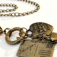
Here is "Love Charm Necklace Antique Brass" by Artistic Pendants:


I like this picture because it's not a straight on shot -- it shows some depth.  And it also shows the whole necklace, which is definitely a shot you want to show.  Because it is not square it wouldn't work well as the first shot.  Artfire always shows little square icons.  So I cropped it to make it square and zoom in on some of that detail.  It's a little fuzzier than I would like, but you get the idea:


Here are some Circle and Loop earrings by Caty Ann's Creations:


Circles and Loops Earrings E110 2.5
I like this shot because it looks black & white and creates a mood.   But if I add another cropped shot, you get a much better look at the earrings:


Once again, a little fuzzier than I'd like it to be.


Here's a pet Adoption Awareness Pendant by Mz Tracyr using a rock and maybe some scrapbook paper as props:

Save a Life Pet Awareness Necklace


In my opinion, the rock and the scrapbook paper are a little distracting.  You want people to notice the pendant, not the rock.  Here it is cropped:


While you can't see the chain, you can always show it in another photo.


Laura of Sil Jewel has listed this Polymer Clay Silver Adjustable Flower Ring.  Here the ring is shown on the ring mandrel.


Polymer Clay Silver Adjustable Flower Ring


I would rather show more of the beautiful detail in the ring, and less of the ring mandrel, like this:


Here is a Leather Wrap Bracelet with red howlite by Tammi of Pink Sunset Jewelry Designs:


Wrap Bracelet Leather with Red Dyed Howlite with Silver Heart Charm


There's nothing wrong with this picture, but if I was looking at this bracelet what would catch my eye would be the red howlite focal bead.  So I might really look at it like this:


Unique Designs by Tammy made these patriotic Red White and Blue Earrings:


red White and Blue Earrings


I think the earrings are pretty small in the picture and there's a lot of extra space.  Those thumbnails are pretty small, so I like to make my piece as large as possible.  Here's what it looks like after cropping it:


Not a huge difference, but you get a better look at the earrings.


Zoomgraphik made this Blue Lapis Bracelet with Pewter Beads:


Blue Lapus gems with Pewters beads


After cropping it to see a little more bracelet and a little less prop, I came up with this one:


I also lightened it up a little bit so we can really get a better look at the beads.


These Silver Heart Charm Earrings with baby pink freshwater pearls are by Crystal Bazaar:


Silver Heart Charm  Baby Pink Freshwater Pearl Handmade Drop Earrings


I have this very same purple flower by the way.  You can see it in my Artfire avatar, and right now I'm thinking I need to go crop it some more!  Here's the view after I zoom in on the earrings a little:


Here's the pictures that started it all when I posted in the "jewelry props" thread mentioned previously.  I had some smile copper  metal clay earrings.  Here is the original picture:


copper earrings, Niobium wires, Smile


I was listing some earrings that are basically the same, but instead of "smile" they say "escape".  Here's my new shot:


After a little advice from Jim Juris (you will find him on the Artfire forums quite frequently), I backed off a little bit to follow his rule of thirds.  You can read all about it on the previously mentioned Jewelry Props thread in the Artfire forums.  Here is the modified picture.


I hope you like the close up looks as much as I do.  I think they look great in collections too.  Well, I'm off to revise some more photos.

Sunday, April 29, 2012

Alcohol Inks (Honeycomb necklace)

Tax season is over and it's time to play.  I am planning to do at least one new technique a month (there are so many on my to do list!).  So I thought I'd start out with an easy one:  alcohol ink.

Just the other day I had planned to enter three things in the Lakeland Art Association annual juried show.  When I got my pieces together that I had thought about entering, I decided not to enter one of them, which left me short a piece.  So I started going through my fused glass cabochons thinking I would do something with one of them.  I settled on this piece because I always like the texture in this glass, and this particular piece is unusual because of the color variation:


Usually I think it looks like corn on the cob, but it also reminds me of a honeycomb.  So, why not make a "honeycomb" necklace?  So I'm thinking, what else can I do with a honeycomb theme.  I remembered a chain tutorial I had seen in Art Jewelry Magazine sometime ago.  I didn't need to look up the article because it was a very simple design.  At least that's what I thought.  Actually I looked up the project so I could post a link to it and this design is actually superior to mine.  It was in the July 2007 issue entitled "Egyptian Mystery" by Marie Cristine Knuff.

I had a 3 pack of Adirondack inks and I wanted to play around with them.  So I made three spirals out of copper, put a little of each on a felt square and sort of dabbed the inked felt against the copper -- don't rub, because that rubs it off more than puts it on it seems.  Anyway, here are my three spirals after I inked them:

The ink colors are Sail Boat Blue, Watermelon, and Citrus.  I think the Watermelon on copper looked very reddish orange and went well with my cab:


Now my plan started to take off.  I started making lots of spirals and colored them all with my watermelon ink.  You might be able to see the groove around the edge of my glass cab that I did with my grinder.  I wire-wrapped the cab with copper wire and colored it also.  Then I put the links together into a chain and wire-wrapped my cab right into it.  I made it asymmetrical, which is unusual for me, but nature isn't symmetrical so this couldn't be either.

I did learn something here which I can pass on to you and save you a little trouble.  Even though the ink had dried on my spirals, it still rubs off.  Here's a pic of the red ink that rubbed off on my fingers:


So after I put the chain together, the ink had noticeably rubbed off and I had to redo it.  I also hand forged a clasp out of thick copper wire and colored that with the ink as well.  I added a little bronze chain and for the finishing touch:  a copper bumble bee colored with the citrus ink.  Finally I finished it all up with a couple coats of acrylic spray.  (Don't want the red ink rubbing off on someone when they wear it.)  Here is the finished necklace and the earrings to match:


Sunday, February 12, 2012

The Jury Process

Last week I was fortunate enough to be able to attend the jury process for the Broad Ripple Art Fair that will take place this summer in Indianapolis.  Broad Ripple is one event whose jury process is open to the public.  The jurying took place at the Indianapolis Art Center, who hosts the Broad Ripple show.  Although I did not apply for the show, I saw this as an opportunity to educate myself on the jury process, and what it takes to get in to the more selective shows.  My husband was nice enough to take the day off for the drive to Indy, and we arrived at the art center a tiny bit ahead of schedule because I wanted to make sure I didn't miss either of the two jewelry categories.

 
The Indianapolis Art Center (from their website)

When I arrived and took my seat in the mostly empty auditorium, the jury was running way behind.  They were currently looking at ceramics.  The judges, I think there were five of them, were seated down front.  The application process was done through Zapp.  Each judge had a laptop on the table in front of them.  From where I was seated, behind the roped off area for spectators, I could see that each entry was shown as a row of 4 pictures across the screen, with other information above or below.  The judge could scroll up or down between the applicants, and enter comments.  Also, the applicants photos were projected on a large screen in front of them.  At the beginning of a category they would quickly go through all the entries on the large screen.  Then they would go through each entry one by one.  Each entry was shown on the screen for 30 seconds as an artist's statement was read.  Each artist had submitted three pictures of his or her work, along with a booth shot.  The 4 pictures were shown at the same time on the screen, in 2 rows of 2, with the booth shot in the lower right hand corner.  Every once in awhile a judge would comment out loud, but from where we were sitting we couldn't hear what was said. 

Even with the ceramics, the thing that immediately struck me was something I had heard before, but didn't always recognize or understand it:  a "cohesive body of work"  Without getting into a whole other blog entry, it means the pieces look alike, same materials, same process.  When the pictures are shown on the screen together, it is much easier to see what this means.  They should be like 3 components of one big picture, 3 pieces to the same puzzle.  It seemed to me that even the colors should be similar.  I also noticed that the three pieces of art, all appearing to be professionally photographed, usually had the same background.  If you are ever in doubt about your "cohesive body of work", put your pictures side by side and look at them as one unit.

The artists statements (or whatever they were called) were not really about the artists, but about their work and the techniques that they use.  Things like: " I grow crystals in my glazes for two weeks", "all hand drawn - no stencils"  This statement is the artist's chance to tell what is special about their work.  Some other bits that I heard (not necessarily pertaining to pottery) were "interaction between humans and nature", "functional, yet a literal piece of art", "all limited edition", "dimensionally arranged", "free-form designs", "inspired by architectural forms"....   However, if there is something special about your process, this is your only chance to convey that to the judges.

Jewelry is the largest category at Broad Ripple, so they have split it into two categories:  metalwork and other.  At some point prior, they had decided in order to save time they were going to show the entries for 20 seconds rather than 30.  I expected to see the occasional crappy entry -- I never saw it.  I did see loads of stunning pieces by very talented artists.  Once again, I saw the cohesive body of work.  When it came to their statements, the jewelers were pretty much all business:  "I make ____ out of ___ using ____ [technique]."  I guess maybe the jewelry artists are so busy explaining their techniques, they don't have time for any of what I call the foo-foo stuff.  All the jewelry appeared professionally photographed and almost exclusively on a graduated grey background.

Booth Shots:  Since the judges don't confide in me, I'm not really sure how important these are, but I can tell you my impressions.  Another artist told me, "they just want to see that your booth looks professional".  In pottery I noticed that booths that had many larger items looked better than booths that had nothing but lots of small items.  That's hard to do in jewelry, however.  What you can do is hang one (or three) large pictures in the back of your booth.  (Blur out any logos in your shot before it is submitted however.)  Almost all jewelry booths used counters with glass (or plexiglass) tops.  Though the art shots were all impressive, I did see some booth shots that looked less than stellar.  Some that looked rather messy.  Though the artists send their work out to be professionally photographed, they can't do the same with their booth, and many times the photos weren't very good.  Another thought, and maybe it's just me, but I think it helps if the booth shot goes with the three art shots, or at least doesn't clash.  This is a highly competitive show, and though some of the artists who received comments about their booths did make it into the show, I would think it could make a difference in whether or not you are invited to participate.

The results of the jury have been posted here:  jury results  If I counted correctly, in the "jewelry, metalwork" category, 21 artists were invited out of 100, or 21%.  In the "jewelry, other" category the numbers were even tougher: 5 out of 47, or not quite 11%.  If you applied for this show and got in: congratulations!  If you applied and didn't get in:  I can honestly say don't take it personally.  These are split second decisions based on what they want for their market and truly not a reflection of the quality of your work.  And if you ever get the chance to sit in on a public jury I would highly recommend it.


Tuesday, January 31, 2012

Hearts a Flutter (or not)

Some of you may have seen the new ArtFire collection I did for Valentines Day called "Hearts a Flutter", that included heart jewelry made by members of the Jewelry Creators Unite in Numbers Guild (JCUIN).  I was specifically looking for hearts that spoke to me and said "flutter"!  However, while looking for the "fluttery" hearts I saw a lot of great heart jewelry that just didn't meet the "flutter" factor.  So I decided to share a few with you here.  

 Sterling Silver and Hematite Heart Within a Heart Necklace

Sterling Silver and Hematite Heart Within a Heart Necklace by Bluetina


Art paper hearts earrings, handmade metallic and rice paper jewelry

Art paper hearts earrings, handmade metallic and rice paper jewelry by Daly Craft Works


Chunky Valentine Red Starry Jasper Necklace Pyrite Heart Pendant by Epicetera


Red Retro Glass Heart Pendant

Red Retro Glass Heart Pendant by Mz Tracyr


Multicolor Heart Earrings with Red Blue Yellow Polymer Swirl Beads

Multicolor Heart Earrings with Red Blue Yellow Polymer Swirl Beads by Pretty Gonzo


White Marble Hearts Pyrite Valentines Earrings Handmade Jewelry OOAK

White Marble Hearts Pyrite Valentines Earrings Handmade Jewelry OOAK by Shadow Dog Designs


Spiral convertible earrings, crystal heart

Spiral convertible earrings, crystal heart by Shanghai Tai


Survivor Heart Necklace in Black

Survivor Heart Necklace in Black by Strega Jewellry


Well, that's all for now.  Hope you found some inspiration in the not so fluttery hearts!  I know I did!