Here is another fun blog hop. This time it is hosted by Vicki of Shymouse Crafts. The theme for this one is Summer Colors. So if you would like to add an item with summer colors, feel free to do so. Also if you would like to share this block hop on your own blog, click on "get the code here" below. Enjoy.
Friday, July 13, 2012
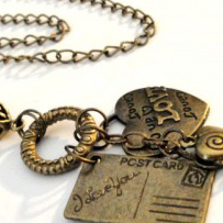
Blog Hop: Earthtones
Hopes and Dreams Studio is having a blog hop. You can post your handmade item here. If you have a blog you can "get the code" below to share this on your blog. Thank you to Hopes and Dreams Studio for hosting!
Sunday, July 1, 2012
Cropping Your Photos to Show Detail
The last couple of weeks I have been very inspired to improve my product photography by reading a lengthy post in the Artfire Forums. Here is the link to it, but I think you have to be logged in to Artfire to read it:
Photography Q & A
I'll warn you, it's 76 pages long!
Now I am an amateur photographer, and I have even won awards for my photography. But when I approached taking photographs for my Artfire shop, my approach was to show the piece -- like the Sears catalog maybe? I showed what the product looked like on a plain background, usually white and sterile. Anyway, I have come to the conclusion that selling handmade jewelry online requires some props. Not anything fancy or distracting, but particularly something to add some texture and some depth. The other thing I have decided is that it's good to zoom right in and get a close up shot. You don't need to show the entire piece in your first shot. Get in close and show the detail to catch their eye, and leave them wanting to see the rest of it. Make sure by the time they looked at the other pictures that they have seen the other parts though! There's another thread on this subject in the Artfire forums:
Jewelry Photo Props
Now I'm sure some people will probably disagree with me, but that's my opinion and I'm sticking to it! So I decided to see what I could do with some existing shots by my fellow members of the JCUIN (Jewelry Creators Unite In Numbers) guild. I hope they don't mind!
Here is "Love Charm Necklace Antique Brass" by Artistic Pendants:

I like this picture because it's not a straight on shot -- it shows some depth. And it also shows the whole necklace, which is definitely a shot you want to show. Because it is not square it wouldn't work well as the first shot. Artfire always shows little square icons. So I cropped it to make it square and zoom in on some of that detail. It's a little fuzzier than I would like, but you get the idea:


Once again, a little fuzzier than I'd like it to be.
Here's a pet Adoption Awareness Pendant by Mz Tracyr using a rock and maybe some scrapbook paper as props:

In my opinion, the rock and the scrapbook paper are a little distracting. You want people to notice the pendant, not the rock. Here it is cropped:

While you can't see the chain, you can always show it in another photo.
Laura of Sil Jewel has listed this Polymer Clay Silver Adjustable Flower Ring. Here the ring is shown on the ring mandrel.

I would rather show more of the beautiful detail in the ring, and less of the ring mandrel, like this:

Here is a Leather Wrap Bracelet with red howlite by Tammi of Pink Sunset Jewelry Designs:

There's nothing wrong with this picture, but if I was looking at this bracelet what would catch my eye would be the red howlite focal bead. So I might really look at it like this:

Unique Designs by Tammy made these patriotic Red White and Blue Earrings:

I think the earrings are pretty small in the picture and there's a lot of extra space. Those thumbnails are pretty small, so I like to make my piece as large as possible. Here's what it looks like after cropping it:

Not a huge difference, but you get a better look at the earrings.
Zoomgraphik made this Blue Lapis Bracelet with Pewter Beads:

After cropping it to see a little more bracelet and a little less prop, I came up with this one:

I also lightened it up a little bit so we can really get a better look at the beads.
These Silver Heart Charm Earrings with baby pink freshwater pearls are by Crystal Bazaar:

I have this very same purple flower by the way. You can see it in my Artfire avatar, and right now I'm thinking I need to go crop it some more! Here's the view after I zoom in on the earrings a little:

Here's the pictures that started it all when I posted in the "jewelry props" thread mentioned previously. I had some smile copper metal clay earrings. Here is the original picture:

I was listing some earrings that are basically the same, but instead of "smile" they say "escape". Here's my new shot:

After a little advice from Jim Juris (you will find him on the Artfire forums quite frequently), I backed off a little bit to follow his rule of thirds. You can read all about it on the previously mentioned Jewelry Props thread in the Artfire forums. Here is the modified picture.

I hope you like the close up looks as much as I do. I think they look great in collections too. Well, I'm off to revise some more photos.
Subscribe to:
Posts (Atom)