Shanghai Tai by Roxanne Coffelt: Jewelry design, metal clay, metal work, pearls, fused glass,helpful tips and techniques, etc. Please visit me at www.shanghaitai.com to see some of my work that is actually finished!
Yesterday I spent pretty much all day long working on my booth shot. Those of you who enter juried shows know that you usually have to submit three pictures of your work and one of your booth. Sounds easy enough, but it's far from it. You can't just take a shot of your booth at a show. Your booth doesn't even necessarily have to be set up in the same layout as a show. At a show, you set your booth up for the flow of traffic through your booth. Here you are setting it up so the jury can see it. If you are reading this as a novice, first of all let me say your tent/canopy must be white. Most people go to Walmart and buy a cheap one for their first craft show. They're always some color other than white. Soon after they always end up having to replace them because almost all art shows require white canopies. Last fall I happened to score some used Flourish mesh panels for my EZ Up. (EZ Up gets a bad rap sometimes, but my EZ Up has held up where other, more expensive tents have not.) These panels not only help stabilize the tent, but you can also hang things from them. Since I have some jury photo deadlines coming up at the end of the month, I have been watching the weather closely. It has been really cold, and we have had snow on the ground. Yesterday was my big chance. My husband, who is the muscle, starting setting up my EZ Up in the morning, and I put in the floor and the display cases. He had set it up in the driveway, with the door facing the house. Actually a pretty good idea, I thought, because it's much more secure when I set all the jewelry out. What I failed to consider was the location of the sun. Actually it wasn't that I didn't consider it, I just thought it wouldn't matter inside the tent. I was wrong. It was supposed to be cloudy, but by the time we were set up, the occasional cloud that came by was higher in the sky than the sun was. Up north in the winter, the sun is low in the sky to the south from sunrise to sunset. Our driveway pretty much faces south, which means the back of my tent was to the sun. I never realized that the tent does not really block out the sun. Here is my first shot:
Ok, this looks awful. I know it. And it looks even worse in the photo than it does in real life! You can't see it, but I am shooting right into the sun. Would you go into this booth? Probably not. By the way, this is also the spare EZ Up that came with the sides. It isn't as clean as my regular one, and you will notice that when it is fully up, the side walls don't reach the ground. That's ok, because I can fix that in photoshop. We have only two of the Flourish panels up, in the rear and the right hand side. I was planning on hanging a couple of displays on the panels, but once I saw the size of the holes I knew it wasn't going to work. That's ok, I have a plan B, but it wasn't going to be ready before the end of the day. No big deal. This is why you always set things up before you use them, so you don't get any surprises on show day! My next step was to upload the picture online and get some advice from some other jewelry artists. Based on their advice, we moved the display cases so they were staged for the picture. They also suggested I add a rug. Now I have seen these big rugs, and I have no intention of hauling one of those around. My husband said he knew of a rug that had just been sitting around in the basement, rolled up since we moved (years ago.) So we added it. After we got the feedback and made the changes, the sun was beginning to go down, and the lighting totally changed. My DSLR camera was on a tripod, and I put it on a self timer so that there will be no motion from me clicking the shutter button. That way it can do a long exposure if it needs to. Here is the last picture I took before editing:
The improvement is amazing. All we did was rearrange the cases and add the rug. But the lighting is also a huge improvement. I love how the rug adds some color, and it's small enough that I can take it to shows. By the time we got this done the light was fading fast, so this one will have to do. Here is the final image after cropping and editing:
That is a booth I would go into! Before next year I hope to add some sheer curtains in the corners to hide the poles, and three large jewelry photos across the back of the booth. For now it will have to do. But we certainly hit the "sweet spot" in the weather because today, as you can see, we got more snow:
It's true, I am not a professional photographer. The impetus for this post is the fact that I do collections on Artfire. They are a great way to promote your work, because the people featured in the collection will promote the collection on social media. If your collection is good, you may be lucky enough to see it on the front page of Artfire, or in the Artfire daily email. The same can be said for Etsy treasuries. Sometimes I see an item that I would really love to include in my collection but I can't because it's out of focus, too dark, too cluttered, etc. When I do a collection, it always has a theme. Once I choose the theme, I go looking for items that fit that theme. I want to be able to clearly see the item, in focus, and not anything else that might distract me from the item. One of my big things is cropping, because those photos are soooo small, the item needs to take up the space. So, even though I have done this before, I thought I'd see what I could do with a few photos and my Photoshop. I use version CS2, which is a public domain version, so you can get it for free. There are many other programs available also. So I took a few items from the Jewelry Creators Unite in Numbers (JCUIN) guild. I hope none of you mind that I edited your pictures, and if you would like a copy, let me know. I am purposely showing small pictures here because that is what you see in a collection.
original
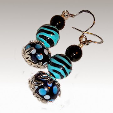
First is a pair of beaded earrings from Shirley's Nook and Cranny. Here is the original photo, right. I like the color combination of the earrings, but I think the picture is a little dark. Also, maybe it's just me, but those dark corners drive me nuts! I wanted to brighten it up a bit, but since I had so much going in the background, I decided just to drop the background out of it. (That was a lot more work than I bargained for because of those little sparkly bits in there.)
edited
Here is the edited version at left. After I got the background out, I made it square. (More on why later.) Now I know about the rule of thirds in photography, and it is a good rule. However, when you have a little thumbnail of an image, I think you want to make maximum use of your space. So I rotated the image to take up more of the canvas. I also brightened it up and put in a slightly graduated background. (A plain white background would have been fine too.)
original
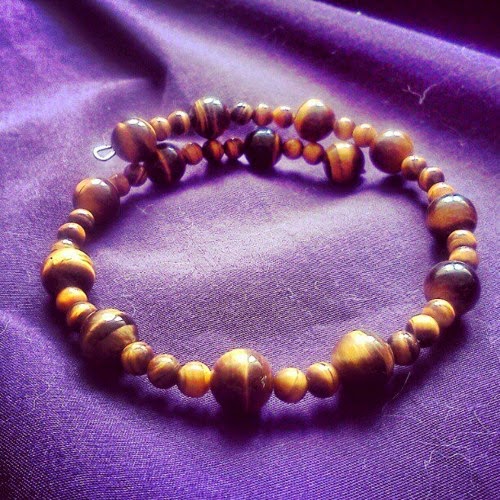
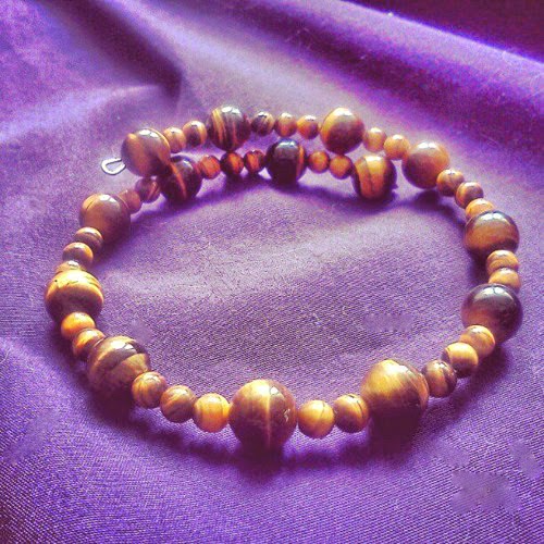
This next one I really didn't do much to. It is a bracelet from Plethora of Jewelry. I like the organic look of the stones. I also like the composition, and the fact that it wasn't shot from straight over the bracelet. The lower angle makes gives more dimension, or depth to the image. The problem, as I see it, is the very harsh shadows caused by bright backlighting. The back of the beads are lit up nicely, but the fronts are in such shadow that you really can't see them well.
edited
I couldn't really fix this one as well as I would have liked. What I did was use the highlights/shadows tool to brighten the shadows and darken the highlights. This gives it less contrast (it doesn't "pop" off the page how I like it to.) But you can see the beads better. I also used the spot healing brush tool to get rid of a few little lint or cat hairs that you can see in the original. Fabric always runs the risk of getting linty, but some are much worse than others. You don't notice it when you take the picture, but when you blow it up on your computer screen, there it is larger than life!!
original
Here is a stunning pendant by Artistic Creations by Rose. The original photo is at left. In a thumbnail, it's hard to see the pendant because of all the other things in the picture. The subject is only taking up about 1/9th of the image even though the photograph itself looks great. The border might keep it out of a collection on things that are round, multicolored, etc.
cropped
Basically all I did was crop this one, so you can more easily see the beautiful pendant. I may have upped the contrast a bit, because I just can't resist doing that. Now the pendant is the center of attention. I would love to put this photo in a [round, spiral, twist, fiery] collection, wouldn't you?
original
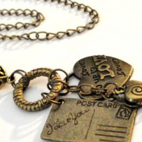
Now more on squares. Here is a pendant necklace by Joyce's Custom Gems. As you can see, it is a vertical picture because she is trying to show the whole necklace. People do want to see the whole thing. If you show a vertical image, however, you don't want it to be your very first picture. The first image is automatically cropped into a square thumbnail, which is the first thing your customers see. In this case, it actually crops out part of her pendant, but leaves the entire chain.
edited
Here is her image cropped into a square (and brightened up), so that when you are on her main page you can see the entire pendant. You can also still see the little fish accent as well. Then if a person wants to see more, they can click on the second (original) photo to see the entire chain.
original
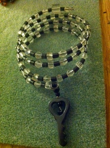
Lastly, here is a bracelet from Tearis's Art Gallery. This one also results in the very bottom of the key getting cropped out of the thumbnail, but I didn't want to drop the background of of this one too. The main problem is that it's so dark. Also the fact that the image goes off of the background causes some distracting edges.
edited
If I really wanted to put a lot of effort into this, I would drop out the background, drop the image into a square canvas and rotate it like I did the first pair of earrings. But in this case I wanted to show you what a difference it makes when we just brighten it up. I used the shadows/highlights option and then the brightness/contrast. Then I couldn't resist using the clone tool to copy and paste little sections of background over those distracting edges. I hope that you guys don't mind that I messed with your photos, and I hope you like what I did. Of course, it's better (and a lot easier) to do these things with the camera than trying to edit it later. Sometimes it's easier just to re-shoot it. And one thing that must be done with the camera is to get your pictures in focus. Some of these pictures are very low-resolution (small files) so that is another reason for keeping the pictures small here. Beginning in October 2014, it's my understanding we will all have the zoom feature on Artfire, so that's another reason to shoot some higher resolution photos.
The last couple of weeks I have been very inspired to improve my product photography by reading a lengthy post in the Artfire Forums. Here is the link to it, but I think you have to be logged in to Artfire to read it:
Now I am an amateur photographer, and I have even won awards for my photography. But when I approached taking photographs for my Artfire shop, my approach was to show the piece -- like the Sears catalog maybe? I showed what the product looked like on a plain background, usually white and sterile. Anyway, I have come to the conclusion that selling handmade jewelry online requires some props. Not anything fancy or distracting, but particularly something to add some texture and some depth. The other thing I have decided is that it's good to zoom right in and get a close up shot. You don't need to show the entire piece in your first shot. Get in close and show the detail to catch their eye, and leave them wanting to see the rest of it. Make sure by the time they looked at the other pictures that they have seen the other parts though! There's another thread on this subject in the Artfire forums:
Now I'm sure some people will probably disagree with me, but that's my opinion and I'm sticking to it! So I decided to see what I could do with some existing shots by my fellow members of the JCUIN (Jewelry Creators Unite In Numbers) guild. I hope they don't mind!
I like this picture because it's not a straight on shot -- it shows some depth. And it also shows the whole necklace, which is definitely a shot you want to show. Because it is not square it wouldn't work well as the first shot. Artfire always shows little square icons. So I cropped it to make it square and zoom in on some of that detail. It's a little fuzzier than I would like, but you get the idea:
There's nothing wrong with this picture, but if I was looking at this bracelet what would catch my eye would be the red howlite focal bead. So I might really look at it like this:
I think the earrings are pretty small in the picture and there's a lot of extra space. Those thumbnails are pretty small, so I like to make my piece as large as possible. Here's what it looks like after cropping it:
Not a huge difference, but you get a better look at the earrings.
I have this very same purple flower by the way. You can see it in my Artfire avatar, and right now I'm thinking I need to go crop it some more! Here's the view after I zoom in on the earrings a little:
Here's the pictures that started it all when I posted in the "jewelry props" thread mentioned previously. I had some smile copper metal clay earrings. Here is the original picture:
I was listing some earrings that are basically the same, but instead of "smile" they say "escape". Here's my new shot:
After a little advice from Jim Juris (you will find him on the Artfire forums quite frequently), I backed off a little bit to follow his rule of thirds. You can read all about it on the previously mentioned Jewelry Props thread in the Artfire forums. Here is the modified picture.
I hope you like the close up looks as much as I do. I think they look great in collections too. Well, I'm off to revise some more photos.


.jpg)
%2Bcrop.jpg)