Search This Blog

Showing posts with label Roxanne Coffelt. Show all posts

Tuesday, July 26, 2016

Introduction to Precious Metal Clay

The other day I held a metal clay class at the Lakeland Art Gallery.  I thought it might be fun to share what we were working on.


This class was meant for people with no experience, and we were going to make a simple stamped silver pendant (or earrings).  I told them to think about what they wanted to make first.  The clay dries out rather quickly, so you have to have a plan.  That doesn't mean that you can't change your mind in the middle of it, but a plan helps.


Picture by Melodie Koher
Everyone had fun looking at all the stamps and textures I had brought, trying to decide which they wanted to use and how.


Once we got to rolling out the clay, some had a little anxiety, while others really got busy creating.  It is fun to see all the different things people come up with given the same set of instructions.  


Picture by Melodie Koher
In the end, everyone got their pieces dried, sanded and ready to fire.  It was hard for them to imagine that their fragile clay pieces would turn into solid silver.


The next week, after I took the pieces home and fired them in the kiln, everyone got their pieces back.  They had shrunk slightly, and were white, not silver.  A little brushing with soapy water though quickly revealed the silver under the white residue.  Then we got to experiment with a liver of sulfur patina.  We got some great colors, and everyone liked their patina so much, for the most part, they didn't want to remove any of it.  

Here is a look at the finished pieces of my students:


If you are in Northern Indiana and interested in taking a class, subscribe to my Facebook page for notifications on new class offerings.


Sunday, May 3, 2015

Rest, Relaxation and Strategic Planning #1

I am hanging out in French Lick Indiana this week, communing with nature.  We had a timeshare week expiring, and my husband didn't want to use any vacation.  So he said, why don't you just go down to French Lick?  Some of you may know, I am a tax CPA.  I recently saw my doctor, and he made a comment, something to the effect of, "wow, you really let yourself go during tax season!"  It's true.  So I thought, why not spend a week just relaxing and trying to get back in touch with my creative mojo.  I also need to do some serious strategic planning for my handmade jewelry business.

So here is my creative home base for the week:


Friday night, when I arrived, a couple of ladies arrived next door and were having a little trouble getting their friends to hear them knocking on the door.  They all came from the Chicago area, and invited me over for drinks.  (Shout out to Betty, Linda, Marlene and the three Karens!)

I was starting to wonder if I would get anything done this week,  I didn't bring any jewelry to work on, because this week is about planning.  Some of the questions I have to answer are:

  • Who is my target market for which type of jewelry?
  • Which venue is appropriate for which type of jewelry?
  • Who buys jewelry on which venue?  (Etsy, Artfire, Storenvy, Aftcra, etc.)
  • How do I get in touch with my target market?
  • What display to use in my art show booth in addition to the display cases?
  • What possible themes could I use for next years jury photos?

Yesterday was day one, and I have made some progress.  (Also this morning I came up with a great idea for a video!)  After doing a little research online, I have learned this:

  • People of ALL ages shop online
  • Younger people spend more money online than older people
  • Men spend more online than women
  • Women tend to buy expensive jewelry as a gift, but not so much for themselves.

I will try to post updates of my progress using the painfully slow internet here.  But now it's time for my brain to change gears, so I will leave you with a video.  Not so much the video, but the audio is of all the birds singing outside my balcony even though I am right in town.  You may have noticed my ipod speaker in the picture above.  I turned it off just to enjoy all the racket the birds were making.  I hope you enjoy it too.


Friday, September 26, 2014

Jewelry Photos for Collections

It's true, I am not a professional photographer.  The impetus for this post is the fact that I do collections on Artfire.  They are a great way to promote your work, because the people featured in the collection will promote the collection on social media.  If your collection is good, you may be lucky enough to see it on the front page of Artfire, or in the Artfire daily email.  The same can be said for Etsy treasuries.  Sometimes I see an item that I would really love to include in my collection but I can't because it's out of focus, too dark, too cluttered, etc.

When I do a collection, it always has a theme.  Once I choose the theme, I go looking for items that fit that theme.  I want to be able to clearly see the item, in focus, and not anything else that might distract me from the item.   One of my big things is cropping, because those photos are soooo small, the item needs to take up the space.  So, even though I have done this before, I thought I'd see what I could do with a few photos and my Photoshop.  I use version CS2, which is a public domain version, so you can get it for free.  There are many other programs available also.  So I took a few items from the Jewelry Creators Unite in Numbers (JCUIN) guild.  I hope none of you mind that I edited your pictures, and if you would like a copy, let me know.  I am purposely showing small pictures here because that is what you see in a collection.
original

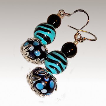
First is a pair of beaded earrings from Shirley's Nook and Cranny.  Here is the original photo, right.  I like the color combination of the earrings, but I think the picture is a little dark.  Also, maybe it's just me, but those dark corners drive me nuts!  I wanted to brighten it up a bit, but since I had so much going in the background, I decided just to drop the background out of it.  (That was a lot more work than I bargained for because of those little sparkly bits in there.)
edited

Here is the edited version at left.  After I got the background out, I made it square.  (More on why later.)  Now I know about the rule of thirds in photography, and it is a good rule.  However, when you have a little thumbnail of an image, I think you want to make maximum use of your space.  So I rotated the image to take up more of the canvas.  I also brightened it up and put in a slightly graduated background.  (A plain white background would have been fine too.)


original
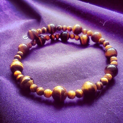
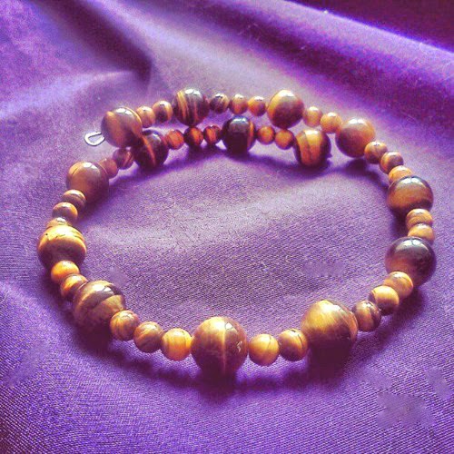
This next one I really didn't do much to.  It is a bracelet from Plethora of Jewelry.  I like the organic look of the stones.  I also like the composition, and the fact that it wasn't shot from straight over the bracelet.  The lower angle makes gives more dimension, or depth to the image.  The problem, as I see it, is the very harsh shadows caused by bright backlighting. The back of the beads are lit up nicely, but the fronts are in such shadow that you really can't see them well.  
edited
I couldn't really fix this one as well as I would have liked.   What I did was use the highlights/shadows tool to brighten the shadows and darken the highlights.  This gives it less contrast (it doesn't "pop" off the page how I like it to.)  But you can see the beads better.  I also used the spot healing brush tool to get rid of a few little lint or cat hairs that you can see in the original.  Fabric always runs the risk of getting linty, but some are much worse than others.  You don't notice it when you take the picture, but when you blow it up on your computer screen, there it is larger than life!!

original
Here is a stunning pendant by Artistic Creations by Rose.  The original photo is at left.  In a thumbnail, it's hard to see the pendant because of all the other things in the picture.  The subject is only taking up about 1/9th of the image even though the photograph itself looks great.  The border might keep it out of a collection on things that are round, multicolored, etc.


cropped
Basically all I did was crop this one, so you can more easily see the beautiful pendant.  I may have upped the contrast a bit, because I just can't resist doing that.  Now the pendant is the center of attention.  I would love to put this photo in a [round, spiral, twist, fiery] collection, wouldn't you?


original

 Now more on squares.  Here is a pendant necklace by Joyce's Custom Gems.  As you can see, it is a vertical picture because she is trying to show the whole necklace.  People do want to see the whole thing.  If you show a vertical image, however, you don't want it to be your very first picture.  The first image is automatically cropped into a square thumbnail, which is the first thing your customers see.  In this case, it actually crops out part of her pendant, but leaves the entire chain.

edited
Here is her image cropped into a square (and brightened up), so that when you are on her main page you can see the entire pendant.  You can also still see the little fish accent as well.  Then if a person wants to see more, they can click on the second (original) photo to see the entire chain.


original
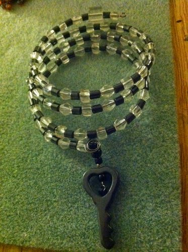
Lastly, here is a bracelet from Tearis's Art Gallery.  This one also results in the very bottom of the key getting cropped out of the thumbnail, but I didn't want to drop the background of of this one too.  The main problem is that it's so dark.  Also the fact that the image goes off of the background causes some distracting edges.

edited
If I really wanted to put a lot of effort into this, I would drop out the background, drop the image into a square canvas and rotate it like I did the first pair of earrings.  But in this case I wanted to show you what a difference it makes when we just brighten it up.   I used the shadows/highlights option and then the brightness/contrast.  Then I couldn't resist using the clone tool to copy and paste little sections of background over those distracting edges.

I hope that you guys don't mind that I messed with your photos, and I hope you like what I did.  Of course, it's better (and a lot easier) to do these things with the camera than trying to edit it later.  Sometimes it's easier just to re-shoot it.  And one thing that must be done with the camera is to get your pictures in focus.  Some of these pictures are very low-resolution (small files) so that is another reason for keeping the pictures small here.  Beginning in October 2014, it's my understanding we will all have the zoom feature on Artfire, so that's another reason to shoot some higher resolution photos.


Tuesday, September 23, 2014

Volunteering at the Gallery

The other day I spent the afternoon volunteering at the gallery, so I took some glass cabs and wire along with me.  With all the pendants sitting there, I just had to take a picture, so I thought I'd share what I got accomplished:


These are all either copper, Argentium sterling, or gold filled.  Now I just have to photograph and list them.


Sunday, July 20, 2014

My First Metal Clay Video

Yesterday I spent a few hours at a studio of a friend of mine, Sue of Purr-fectly Unique Jewelry, shooting my first jewelry lesson video.  Sue and her son have just started a jewelry lesson website, and asked me to do a tutorial on metal clay.

For the first one, I decided to do a very easy beginner project:  a simple stamped pendant in silver metal clay.  This doesn't require any experience.  (It does, however, require a kiln.)

Here is Christopher setting up the lights.


Here I am getting ready to do the introduction (under the hot lights!):


Photo by C Karczewski, CK Entertainment


When the video is finished, there will be a trailer, which I will share here on my blog.  In the meantime, you can check out the site at www.JewelryLessonVideos.com

Friday, July 4, 2014

Black Max Patina

Right now I am busy making jewelry for an upcoming show.  (My last show went great, so I'm a little low on inventory!)  Yesterday I was working with some silver metal clay that I had just fired, so thought I'd take a couple of behind the scenes pictures.

A patina is a coloring that we put on the metal, usually to show detail.  In this case, I had some earring components that had Chinese characters stamped in them, and I want to make sure the characters are visible.  Silver is so reflective, that unless I do something, they will be hard to see.

Below is what they look like when I start.  Here they are all shiny, because I have run them through the tumbler.  The Black Max is in the jar.  It looks like really dark pee!  But it will turn black on the silver.


I could just dip them in the Black Max, but then that's more black to gunk up the steel shot in my tumbler.  So I decided just to paint the detail with the patina, and that way, hopefully, it would polish up quicker and be less dirty on my shot.

Here are the pieces after I painted them:


Next I put them in my tumbler with the steel shot and burnishing compound and tumble them for awhile.  The surface gets clean but the shot doesn't get into the recesses, so those don't get clean.  That's the plan anyway.

Here they are in my tumbler:


After tumbling for awhile, the letters/characters are black, and the rest is shiny silver.  I didn't take a picture of them because I was too anxious to make the earrings.

Here is a picture of the finished product:


Hope you enjoyed that quick look at Black Max patina.  Do you ever use patina?  What kind of patina do you like to use?


Sunday, February 2, 2014

The Ubiquitous Agate


I recently spent the week in French Lick, Indiana.  There's not much to do there in the winter, but one of the highlights of my trip was visiting Hinshaw Rocks and Gems.  Apparently the Lapidary Journal named them "one of the top ten stone polishers in the nation."  I went looking for cabochons and I found plenty.  I ended up buying some irregular shaped machine polished cabs rather than the perfectly shaped, hand polished cabs.  

My stash includes picture jasper, beach jasper, petrified wood, Ohio flint, feldspar, moss opal, rhyolite, unakite, youngite, marl and tiger iron.  And that is only about half of them.  The other half are all agates.  There are so many kinds.  Some are named for where they come from: Mexican, Brazilian, Kentucky and a gorgeous Medicine Bow Plume agate.  Others are apparently named for their looks:  moss, red moss, holly blue, zebra and crazy lace.   Here is a picture of my crazy lace agate cabs.


There are so many different kinds of agates that I was inspired to do my monthly JCUIN (Jewelry Creators Unite In Numbers) collection of handmade jewelry on agates.  I named it The Ubiquitous Agate.  So here is a little eye candy from that collection.

Plume Agate Pendant, Red On Blue, Silver Wire Weave Gallery Men Women
Plume Agate Pendant, Boho Wire Wrapped
First up is our friend Margaret, from Boho Wire Wrapped.  Margaret lost her battle with cancer a couple weeks ago.  Her family has her shop open for now to sell her inventory.  At left is a stunning blue plume agate and sterling silver pendant.  Time is running out to own a piece by this talented artisan.  She will be greatly missed on Artfire.


"Selene" - Titanium-Coated Drusy Agate Necklace
Drusy Agate Necklace by Adora by Simona
This necklace, called "Selene", is made by Simona of Adora by Simona.  It features a pendant with a titanium coated drusy agate along with a smoky topaz, light peridot and golden citrine.  A druzy or druse (pronounced drew-zee) means that the stone has little crystals on it.  In this case the agate has a titanium coating that gives it a metallic look.  The metal is sterling silver.


Handmade Necklace Blue Lace Agate Pearls Beaded Jewelry OOAK Summer
Earth and Sky necklace by Shadow Dog Designs
This necklace features blue lace agate.  When you think of blue lace agate, you normally think of the blue portion of these stones with the lacy darker blue veining.  The brown in these definitely adds interest to the stones, and inspired the artist, Catherine of Shadow Dog Designs, to name it "Earth and Sky".  A very appropriate name in my opinion.


Wire Wrapped Druzy Pendant
Blue & Black Druzy Pendant, Jewelry by BeaJae
I'm not sure what kind of agate this is, but it's also a druzy.  I find it interesting for a couple of reasons.  First is the different colors of banding that you can plainly see.  Less obvious is the vug, or little pit that you can see on on the right, slightly below the center of the picture.  There are several ways a cavity can form in a rock, and they often have little crystals in them.  You can see that this one has some crystals on the surface, and there may be some in the vug also.  (I just learned about vugs during my visit to Hinshaw Rock and Gems!)  This pendant is by Jewelry by BeaJae and is wire wrapped in copper.


Crazy Lace Agate and Sterling Silver Ring, Size 6-1/4 r625czlc2158
Crazy Lace Agate Ring, Lunar Skies
I am a huge fan of Quentin of Lunar Skies.  This handmade, sterling silver ring features a crazy lace agate.  Just one more example of the variety of colors and patterns that you can find in agates.  The granulated silver balls on the side are a nice compliment to the circular patterns in the agate itself.  Quentin also cuts his own stones!


Brazilian Agate Sterling Silver Wrapped Pendant
Brazilian Agate Pendant, Wagoner Wire Works

This sterling silver wire wrapped pendant is by Wagoner Wire Works.  The focal is a Brazilian agate.  This one happens to be blue, because they come in other colors also, and it looks similar to a blue lace agate.  It is accented with two little leaves made of silver wire and a little glass Swarovski pearl.


Pagoda Earrings Black Agate Fine Silver Sterling Ear Wire Handmade
Black Agate Pagoda Earring, Shanghai Tai

Lastly, here is another color of agate, black agate.  These fine silver pagoda earrings with black agate beads are my own design.   They are made from silver metal clay.  They also have non-slip, Argentium sterling silver twist ear wires.  You can find them in my shop, Shanghai Tai.  

I hope you enjoyed this tiny sampling of the many faces of the ubiquitous agate!

Monday, September 2, 2013

Fall Earrings for the Earring Challenge Blog Hop

Candy Corn Earrings, Fused Glass, Handmade Sterling Silver Ear Wires,
Candy Corn Earrings

I stumbled across another blog hop, this one is called Earring Challenge.  It has some great fall earrings.  So I hope it was ok that I decided to join the blog hop and add some of my own.

First I added the most recent pair of earrings that I listed in my artfire shop.

These candy corn earrings I make myself from fused glass.  It was a little work trying to make the kernels, but I think I have it down now.  You will notice they are not identical.  Just like snowflakes, no two candy corn kernels are the same!  The argentium sterling ear wires are hand forged (by me, of course.)


Clip On Earrings, Dichroic Glass, Handmade Textured Multicolored OOAK
Dichroic glass clip on earrings


For my next pair, I thought, clip on earrings would be really different.  Hardly anyone makes clip-ons.  I don't have too many pairs at the moment, but these seem to have a lot of fall colors in them.  I made these from fused dichroic glass.  In addition to the gorgeous colors, they also have a very nice texture to them.  The lines you see going across are actually raised ridges.


Lastly, here is what I will be making today.  I make these copper heart charms from copper metal clay.  This particular pair features a heart with a swirl on a diamond shaped charm.  I add niobium ear wires that have been annodized to make them look like aged copper.  These earrings are perfect for fall!  As a matter of fact, the reason I need to make these today is because I think I have sold out of every single style of copper metal clay earring that I have listed in my store.  So I guess I better get busy!

I hope you enjoyed these, and I hope it was ok to enter the blog hop because I crashed the party!  If you would llike to crash the party too, you will find the link below.